
What it is folks!
One of the things that I dislike hate with EPRCS (and I love EPRCS, so using “hate” just pains me, but I really hate this), is when I embed a chart into a doclet, and it looks nothing like the original. Oracle is aware of the issue and has provided some documentation on possible workarounds (see https://cloudcustomerconnect.oracle.com/files/b117c7c1b1/EPRCS_Embedded_Content_Tips.pdf, but unfortunately, there is no perfect solution.
Here is an example of a chart in Excel:
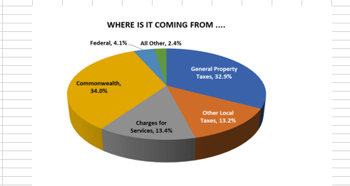
Notice the leader lines and smoothness of the pie chart.
Here is how the chart looks in EPRCS after being embedded:

It’s as if we went from playing on XBOX One to NES Classic! Notice the distortion, the missing data labels on the pie slices, the jumbled data labels on the top, the border, the jaggedness of the pie chart, and the missing leader line.
What’s going on
Even though we are using Microsoft Excel, the technology EPRCS uses on the cloud server to update the embedded content is not Microsoft directly (they don’t run on Linux, go figure!), but a third party. So essentially, we have three vendors: Oracle, Microsoft, and a third party and each one rely on the other to make embedded content work. We could raise a Service Request with Oracle, and they can log a bug with the third party technology, but that won’t resolve the issue in the short term. So…what to do, what to do!

Workaround
If you are looking to avoid all most of the distortion from embedding Excel charts into a doclet, there are two options. The first is to copy the chart (either by Copying as a Picture, or just right-click and select Copy, paste it as an image (or just paste if you copied as a picture), and embed the image into the doclet. What this means, however, is that the reference doclet author will have to check out the doclet and re-paste the image whenever there are updates to the chart/data.
Here is the chart as an embedded image:

Not perfect, but maybe an upgrade to Super NES?? We still have some distortion and jaggedness, but the leader lines and data labels are present.
However, if formatting is of the utmost importance, the second option is to forego embedding the chart altogether and just copy the chart image and paste the image directly into the doclet itself. If you choose this path, you may never return to the world above…Sorry, movie quote from the Corpse Bride. If you do choose this path, whereas your chart will look like the original in Excel, doclet authors must get the image from the reference doclet author each time the chart is refreshed (unless the doclet author and reference doclet author are the same people, then woo-hoo, you just made your life easier!).
Here is the chart as an image:

Pretty snazzy, but with great victory comes great sacrifice!
Another tip is to place the chart image in a text box. This action allows authors to re-size the image to see if it gets closer to the original Excel format.
The last resort would be to change the chart design but why would we do that when we have the most perfect chart EVER?! Hopefully, the tips listed here will help avoid that.
Till next time.
